The Quiet Grammar of Public Signs
Learn how shape, placement, and repetition make public signs easier to read at a glance, and choose a visual approach that fits the place.
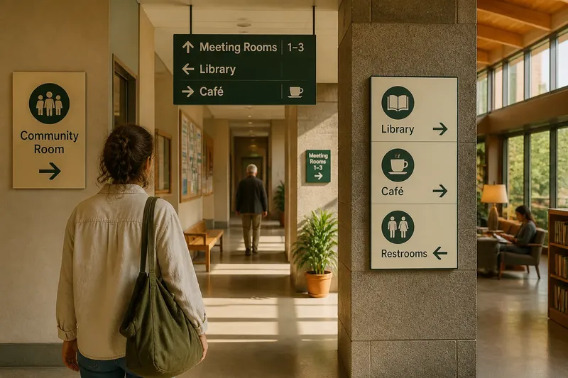
The common mistake with public signs is to treat the wording as the whole message; the cost is a reader who must stop, search, and interpret before knowing what to do. Public signs communicate through a quiet grammar of shape, placement, and repetition, often before anyone reads a word. Choosing a visual approach means deciding what a passerby should notice first, not decorating a sentence after it is written.
Three visual approaches
Most public signs rely on one of three approaches: a recognizable shape, a strong position in the space, or a repeated visual pattern. They can work together, but one should lead. If every feature demands attention, the sign becomes a small argument rather than a clear cue.
- Shape-led: The outline or pictogram carries the first signal. This suits familiar actions and places where people glance rather than pause, such as a door or a marked crossing.
- Placement-led: The sign’s location does the work. This suits directions tied to a decision point, such as a fork in a corridor, where a reader needs guidance before choosing a route.
- Pattern-led: Repeated colors, shapes, or layouts create a visual family. This suits larger places with several related destinations, such as a library or transit hall, where people need to recognize a system across different signs.
Choose shape-led signs when the message can be understood through a symbol alone or with a short label. Choose placement-led signs when timing matters: a direction posted after the turn is too late, however legible it may be. Choose a pattern-led system when visitors need to connect several signs into one map of the place.
Shape before wording
A sign’s outline creates an expectation. A circular prohibition symbol, a directional arrow, and a rectangular information panel do not ask the eye to do the same job. Shape can sort a message into a broad category before the reader processes its wording. A pictogram can then suggest the subject, while a concise label clarifies what the symbol cannot express by itself.
For a useful comparison, look at a familiar instruction shown in two ways: as a small icon beside a paragraph, and as a large, simple symbol above a brief label. The second arrangement often makes the intended action easier to spot at a glance because the visual hierarchy is clear. That does not make every icon self-explanatory. Symbols that could mean several things need a plain text cue, especially when a wrong guess would cause confusion.
Keep the symbol’s silhouette simple enough to distinguish from nearby graphics. Fine details can disappear at a distance or in busy surroundings. Avoid adding decorative marks that do not help identify the action or category. If a shape is unfamiliar to the intended audience, the wording must carry more of the message.
Placement at decision points
Placement answers a different question from shape: where must someone see this information to use it? A directional sign belongs before the choice it explains, not beyond it. A room label belongs where someone can confirm a destination without blocking the passage. A notice about a temporary change should appear where people encounter the affected route or service.
Imagine a community center adding a sign for a meeting room tucked beyond two corridor turns. If the sign appears only at the room door, a visitor may pass the first turn without knowing where to go. Placing a matching direction at the corridor junction, then a room label at the destination, gives the visitor a cue at each decision. The expected observable result is fewer people hesitating at the junction or walking past the room.
Check the sign from the approach a visitor actually takes. A post, open door, display case, or queue can hide a sign that looks obvious when viewed head-on in an empty space. The practical test is simple: stand where the reader will be, then see what catches the eye before the decision has to be made.
Repetition across a place
Repetition turns separate signs into a system. A consistent arrow style, typeface, color family, and placement can tell visitors that several messages belong to the same place. Once a reader recognizes the pattern, they can scan for the relevant cue rather than reconsidering every sign from scratch.
Consistency does not mean making every sign identical. A destination marker, warning, and general notice need different emphasis. Keep the shared features stable, then vary only what helps distinguish the message. For example, a library might use one typeface and a common directional arrow throughout, while using different headings for quiet areas and service desks. The repeating elements identify the system; the differences help readers choose the right sign.
Pattern-led design is less helpful when signs are scattered across unrelated organizations or when colors already carry another meaning in that setting. In those cases, rely on clear wording, familiar shapes, and useful placement rather than assuming visitors know the local visual code.
Choosing a visual approach
Start with the reader’s task. Are they recognizing a familiar instruction, deciding where to go, or making sense of several connected destinations? Match the leading visual approach to that task, then use the others as support. A sign at a corridor junction may be placement-led, with an arrow providing the shape cue and a repeated layout linking it to other directions.
Before settling on a design, check these points:
- First glance: What should the reader notice first? If the answer is unclear, simplify the competing elements.
- Viewing position: Can the intended reader see the sign before acting? If not, move it to the approach or decision point.
- Recognition: Is the shape or pictogram familiar to the people using the space? If not, add a short, direct label.
- Visual family: Does the sign need to connect with other signs nearby? If yes, repeat a small set of consistent design features.
- Surroundings: Do doors, posters, glare, or other signs compete with it? If so, reduce clutter around the message or choose a clearer position.
- Message priority: Is there one main action or destination? If several messages compete, separate them or make their order unmistakable.
For most spaces, a quick walk-through is more useful than adding another layer of design theory. Follow the route as a visitor would, note where decisions occur, and check what is visible at each point. Where local rules or a sign manufacturer’s instructions apply, follow those requirements; the visual approach does not replace them.
Questions about public signs?
Do symbols work without words?
They can work when the symbol is familiar and the action is straightforward. Add a brief label if a reader could reasonably interpret it in more than one way.
Where should a directional sign go?
Place it where a person can use the direction before choosing a route. A second sign at the destination can confirm that the reader has arrived.
How much should signs repeat?
Repeat the visual features that help people recognize one system, such as arrow style or typography. Keep distinctions that help identify different messages, and avoid repeating decorative elements with no practical role.
What is not worth the effort?
Adding ornamental icons or multiple colors just to make a sign look distinctive is rarely useful if the reader still cannot spot the main cue. Spend that effort on clearer placement, a simpler message, or a more recognizable symbol instead.
The quiet grammar of public signs is easiest to judge from the reader’s path: what appears first, what points to the next choice, and what confirms the destination. When those cues agree, the words can stay brief and the space becomes easier to read.